Contrast Sleeve T
Posted by Fabric Godmother on 1st Jan 1970

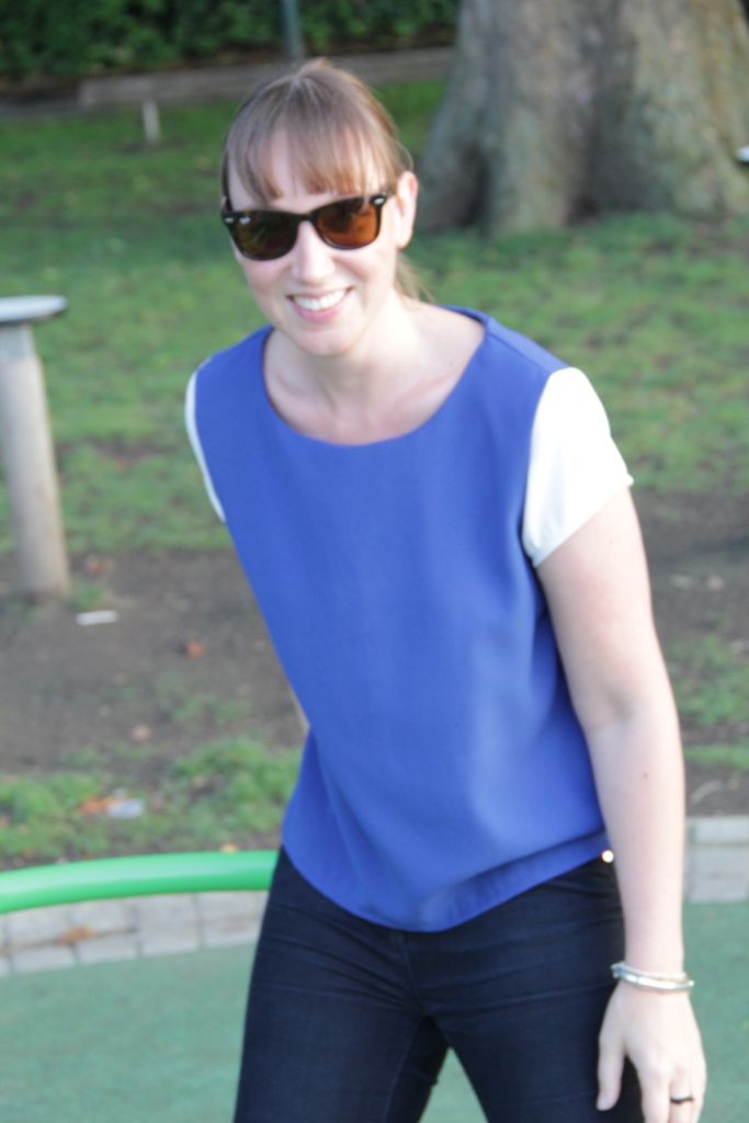
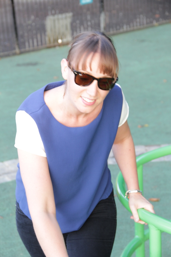
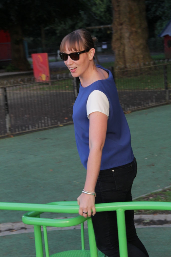
I made this little T shirt with prestige crepe in yale blue and used a contrast colour for the sleeves. The weight and fall of the crepe gives a lovely grown up finish to a simple T shirt, perfect with jeans and trainers or a pencil skirt for work. I didn't use a pattern just drew round an old T shirt that I liked the fit of.

I think if I was making it again I would make it slightly longer as it hovers a little above my hips and when I lift my arms in the air my tummy shows (not a great look)

I really like the slightly scooped neck as it is a bit more flattering than a high neckline.

The fabric Godfather did comment that it looked a little like it could be the new Chelsea strip - ooops maybe a different colour combo next how about black with mink sleeves?


Happy sewing xxx